
Sometimes it’s good to take a big picture look at the stock market.
By “big picture” I mean a monthly chart that is at least three years long.
Here’s one that caught my eye over the weekend.
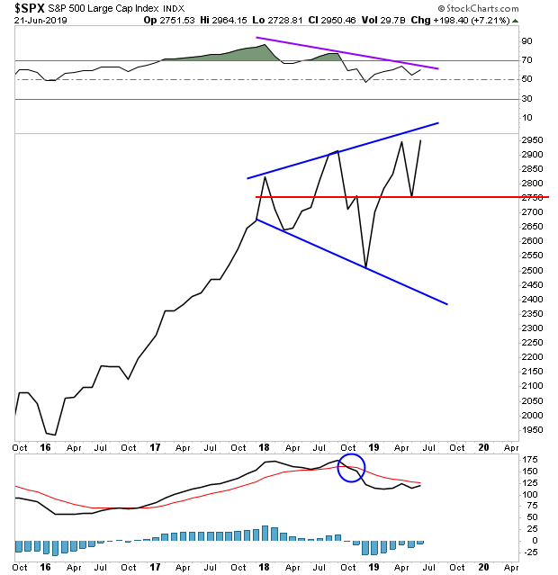
This is the S&P 500’s monthly chart going back almost four years. The key items to note are:
1) The MACD, a key momentum indicator, is on a “Sell” signal (blue circle).
2) The RSI, another key momentum indicator, shows negative divergence (purple line), with each new high established by the stock market coming on a lower RSI reading.
3) The stock market itself is in a massive megaphone pattern… with the ultimate upside target only slightly higher than where stocks trade today.
Take these three items together and you’ve got… TWO signs that momentum is fading, right around the time that the stock market is nearing the end of a major technical pattern.
This tells us, that as exciting as the recent rally in stocks has been… we need to look out. At the very least, stocks should see a correction down support at the red line.
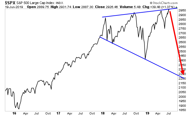
If that line doesn’t hold, we could easily see a drop to the low 2,300s.
This would mean…
A Crash is coming… It might not be this week… but the signs are clear… and I wouldn’t ignore them…
On that note, we are already preparing our clients for this with a 21-page investment report titled the Stock Market Crash Survival Guide.
In it, we outline the coming collapse will unfold…which investments will perform best… and how to take out “crash” insurance trades that will pay out huge returns during a market collapse.
Today is the last day this report will be available to the general public.
To pick up one of the last remaining copies…
https://www.phoenixcapitalmarketing.com/stockmarketcrash.html
Best Regards
Graham Summers
Chief Market Strategist
Phoenix Capital Research