More and more “bells are ringing” for this market rally.
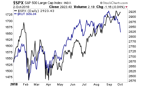
The microcap index, called the Russell 2000, typically leads the overall market in risk on/ risk off moves. With that in mind, what does the below chart suggest?
————————————————-
Who said getting rich from trading was hard?
Since inception in 2015, this trading system has produced average annual gains of 41%.
And it’s doing this with just one trade once per week. In fact we just closed a 15% gain last week. And we only held it 24 hours!
We are closing the doors on this system to new clients on Friday this week.
To lock in one of the last slots…
————————————————-
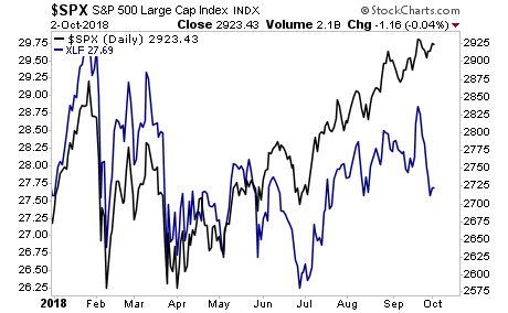
Historically, another market leader are financials stocks. With that in mind, what does the below chart suggest?
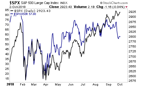
And finally, the number of stocks above their 50-day moving averages is collapsing while the market moves to new highs. Again… what does this suggest is coming to the broader market?
Again, things look great on the surface, but just below it, there are major warnings flashing. And the best part? 99% of investors aren’t paying attention…which is why smart investors who put capital to work here stand to make LITERAL fortunes.
We offer a FREE investment report outlining when the bubble will burst as well as what investments will pay out massive returns to investors when this happens. It’s called The Biggest Bubble of All Time (and three investment strategies to profit from it).
We made 100 copies to the general public.
As I write this there are only a handful left.
To pick up your FREE copy…
Best Regards
Graham Summers
Chief Market Strategist
Phoenix Capital Research
