More and more it looks like a major turn is at hand in the markets.
That turn concerns the US Dollar.
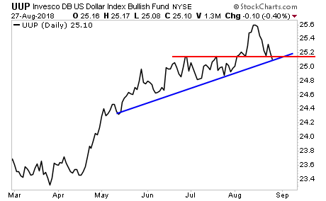
The greenback peaked three weeks ago. It has since taken out support (red line), undoing the entire breakout move. It’s not on the verge of taking out its bullish trendline (blue line).
This, in of itself, is significant. However, what’s REALLY a big deal is to see the US Dollar staging similarly bearish developments against every major currency pair.
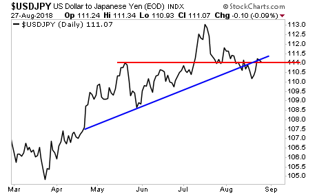
The $USD: Yen pair peaked back in July. It has since taken out its bullish trendline (blue line). Today it is right at support (red line).
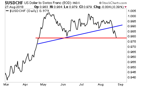
It’s a similar story with $USD: Swiss Franc pair, though in this case, the top came back in May. This pair has already taken out its bullish trendline (blue line) and is just clinging to critical support (red line).
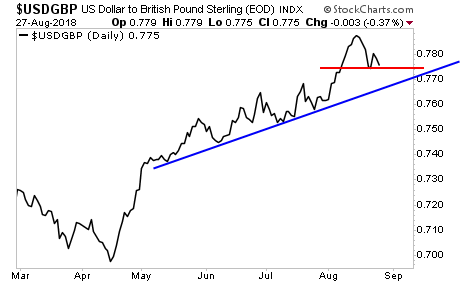
And finally, the $USD: British Pound. Here again it looks like the top is in. This pair is right at support (red line). Once this breaks, there’s a major air pocket down to the bullish trendline (blue line).
Just one of these charts would be a warning. But taken together, ALL of them suggest the financial system is shifting to a “weak $USD” environment.
That’s a heck of a “tell” from the markets. And it’s “telling” us that we’re about to see a major inflationary move as the $USD drops hard.
We just published a Special Investment Report concerning a FIVE secret investments you can use to make inflation pay you as it rips through the financial system in the months ahead
The report is titled Survive the Inflationary Storm
We made 99 copies available to the public.
There are currently just 9 left.
To pick up yours, swing by:
https://www.phoenixcapitalmarketing.com/inflationstorm.html
Best Regards
Graham Summers
Chief Market Strategist
Phoenix Capital Research
