This is getting old.
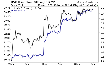
The PPT is now juicing Oil higher, because doing so relieves stress in the junk bond market (a large percentage of junk bond issuers are shale companies that require higher Oil prices to be profitable).
This, in turn, is sending a “all clear” signal to stocks, inducing algos to buy indiscriminately.
Put simply, the formula for this market rig is:
Buy Oil futures, because it will drive Junk Bonds higher, and stocks will follow.
You can see the rig right here in plain sight… Oil (black line) pulling Junk Bonds higher (blue line) almost tick for tick.
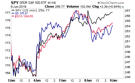
Critical market internals suggest this rig is now coming to an end. Two major market leaders (Goldman Sachs and the Semiconductor index) have not only been lagging on this latest bounce, but both were DOWN yesterday despite stocks rising 1%.
Sure, stocks might bounce a little higher, but at the end of the day, it is clear that corporate profits have peaked, the economy is rolling over, and the Fed is tightening.
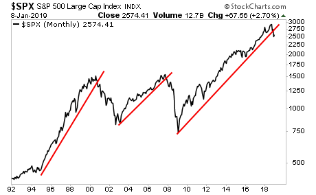
Which of these is likely to be better six months from now? What exactly makes stocks an attractive investment right now?
In chart form… what has changed about this?
A Crash is coming… and 99% of investors will panic when it hits… but not those who have downloaded our 21-page investment report titled Stock Market Crash Survival Guide.
In it, we outline precisely how the crash will unfold as well as which investments will perform best during a stock market crash.
Today is the last day this report will be available to the public. We extended the deadline based on yesterday’s sucker rally, but this it IT… no more extensions.
To pick up yours, swing by:
https://www.phoenixcapitalmarketing.com/stockmarketcrash.html
Best Regards
Graham Summers
Chief Market Strategist
Phoenix Capital Research

