It’s looking more and more like 2007 all over again.
Once again, the economy appears to be roaring as it enters the late stages of a major credit expansion. Once again this late stage credit expansion is entering the inflationary blow off top. And once again, “growth” sectors of the markets are flashing that big trouble is lurking just beneath the surface.
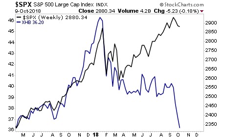
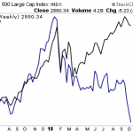
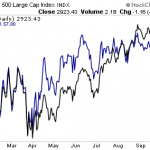
Take a look at homebuilders vs. the S&P500. Does this scream “explosive growth” to you?
————————————————-
Who said getting rich from trading was hard?
Since inception in 2015, this trading system has produced average annual gains of 41%.
And it’s doing this with just one trade once per week. In fact we just closed a 15% gain last week. And we only held it 24 hours!
We are closing the doors on this system to new clients on Friday this week.
To lock in one of the last slots…
————————————————-
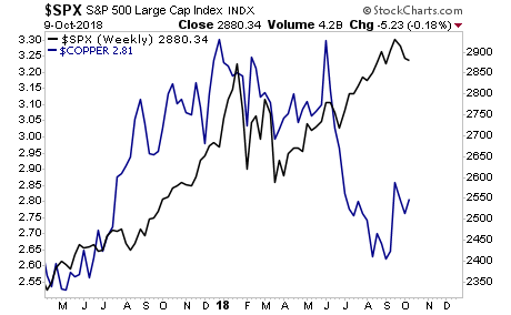
How about copper, the commodity so closely aligned with economic growth than it’s called “Dr. Copper.” Does this chart scream “roaring growth underway”?
And finally, take a look at Lumber vs. the S&P 500. Here again, we see that while stocks continue to hang on to all-time highs… an asset class that is closely aligned with REAL growth has completely imploded.
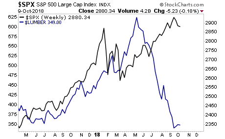
The above charts are telling us we’re now in the “late 2007” stage for the financial system.
We all know what came next…
If you are not already taking steps to prepare for this, we offer a FREE investment report outlining when the bubble will burst as well as what investments will pay out massive returns to investors when this happens. It’s called The Biggest Bubble of All Time (and three investment strategies to profit from it).
We made 100 copies to the general public.
As I write this there are only a handful left.
To pick up your FREE copy…
Best Regards
Graham Summers
Chief Market Strategist
Phoenix Capital Research